Data Journalism and D3
GitHub
Data Visualization link
Background
Create a data journal story to analyze the current trends shaping people’s lives and uncover the health risks facing particular demographics, as well as creating charts, graphs, and interactive elements to help readers understand your findings.All information is from the U.S. Census Bureau and the Behavioral Risk Factor Surveillance System.
The data set included with the assignment is based on 2014 ACS 1-year estimates: https://factfinder.census.gov/faces/nav/jsf/pages/searchresults.xhtml, but you are free to investigate a different data set. The current data set incldes data on rates of income, obesity, poverty, etc. by state. MOE stands for “margin of error.”
Level 1: Basic D3 Data Visualization
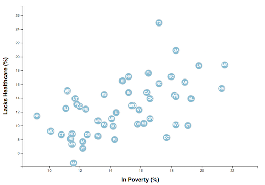
To create a scatter plot between two of the data variables such as Healthcare vs. Poverty or Smokers vs. Age.
Using the D3 techniques we taught you in class, create a scatter plot that represents each state with circle elements.
-
Include state abbreviations in the circles.
-
Create and situate your axes and labels to the left and bottom of the chart.
Level 2: Multi-Axes Interactive Data Visualization
Why make a static graphic when D3 lets you interact with your data?
1. More Data, More Dynamics
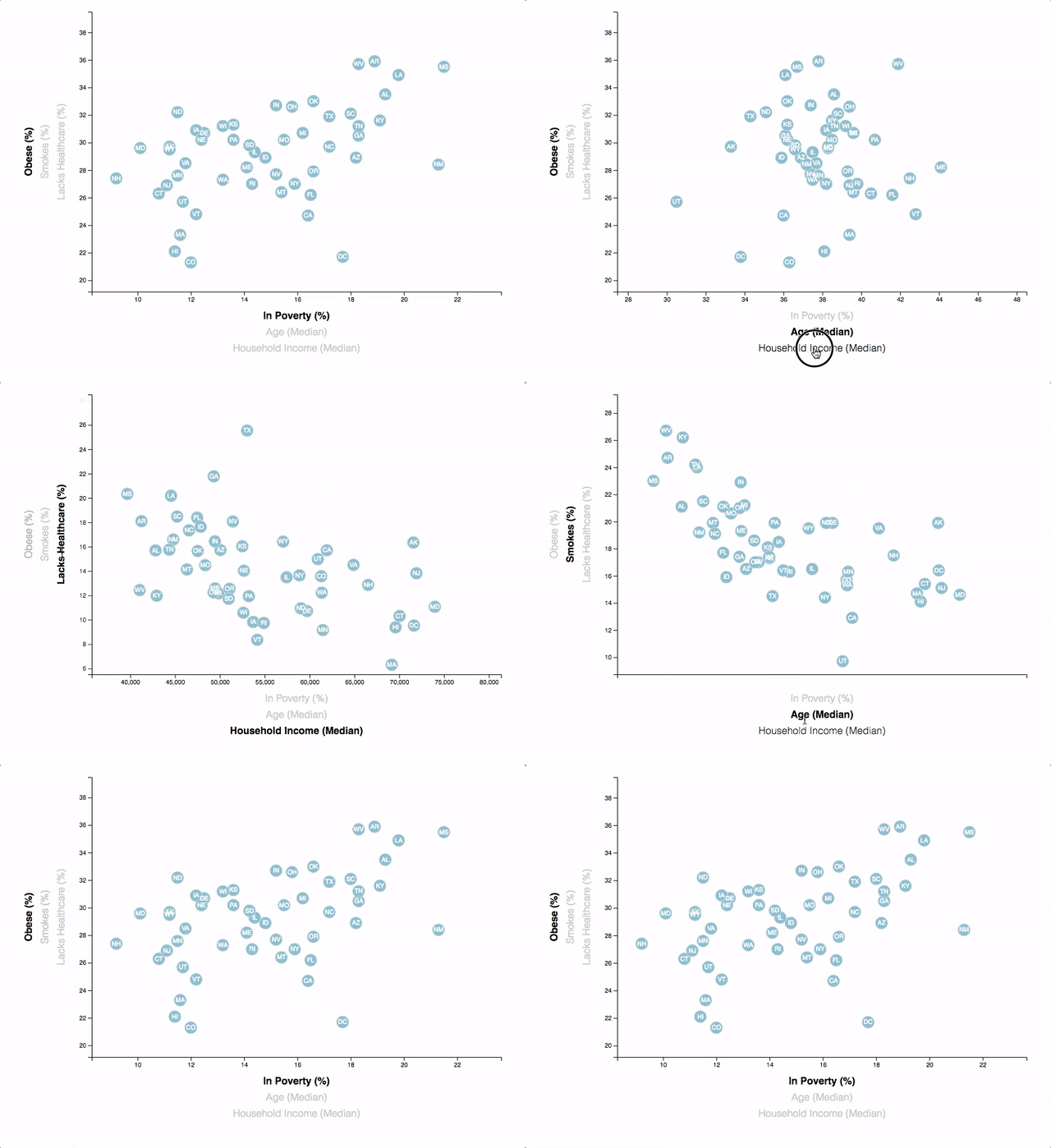
You’re going to include more demographics and more risk factors. Place additional labels in your scatter plot and give them click events so that your users can decide which data to display. Animate the transitions for your circles’ locations as well as the range of your axes. Do this for two risk factors for each axis. Or, for an extreme challenge, create three for each axis.
2. Incorporate d3-tip
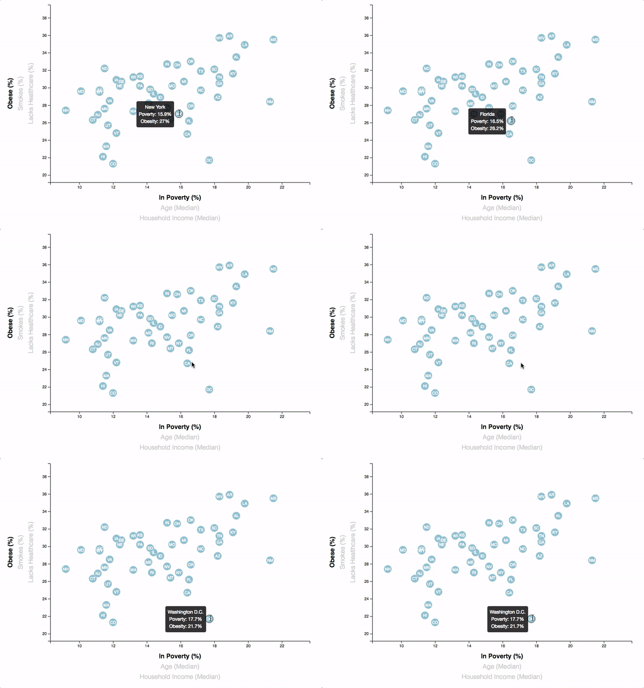
While the ticks on the axes allow us to infer approximate values for each circle, it’s impossible to determine the true value without adding another layer of data. Enter tooltips: developers can implement these in their D3 graphics to reveal a specific element’s data when the user hovers their cursor over the element. Add tooltips to your circles and display each tooltip with the data that the user has selected. Use the d3-tip.js plugin developed by Justin Palmer—we’ve already included this plugin in your assignment directory.
3. Responsive Action
The data visualization will be changed based on the windows size changed.
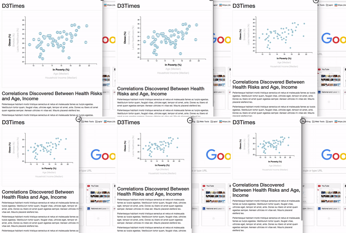
- Reference: David Gotz’s example